Nurturing curiosity, confidence, and connection through child-led learning.
PROJECT SCOPE
Brand Identity | Brand Collateral
THE CHALLENGE
Lyrebird Preschool originally came to us for a website refresh but it quickly became clear the real problem ran deeper.
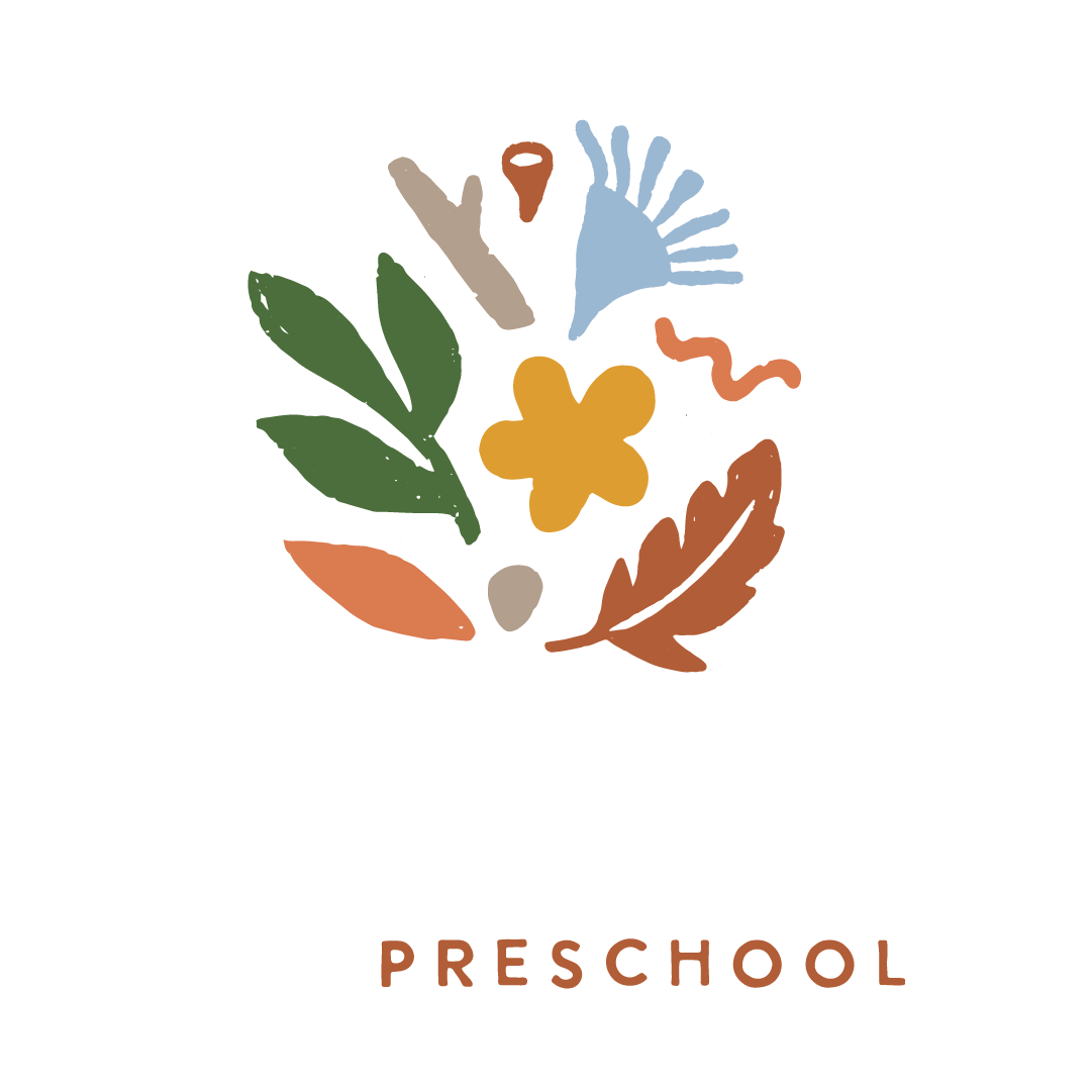
Their existing visual identity no longer reflected who they were. The child-drawn logo and generic aesthetic they'd outgrown bore too close a resemblance to neighbouring schools, and did nothing to communicate what made Lyrebird genuinely different: a progressive, nature-based philosophy rooted in deep respect for the individuality and potential of every child.
They weren't looking for a facelift. They needed a brand that could hold the weight of their values and speak directly to the families who shared them.
THE OPPORTUNITY
The early learning space is crowded with nature cliches, clipart animals, and cheerful fonts that prioritise friendliness over philosophy.
The opportunity was to build an identity that felt as considered and intentional as the education Lyrebird offered one that resonated immediately with contemporary, holistic families and set the school apart from every generic early learning centre in the area.
Create meaningful experiences that foster a love of learning and nurture the growth of kind and thoughtful individuals.
THE OUTCOME
Lyrebird Preschool believes that children learn best when they feel safe, seen, and deeply connected; to the natural world, to their community, and to themselves.
That a child who feels like they belong is a child who is free to grow. That curiosity, when it's honoured rather than managed, becomes the most powerful force in a child's development.
They believe in working deeply with children. In building strong, enduring relationships with families that extend beyond the classroom. In an education that is inclusive of all cultures, all ways of knowing, and all kinds of children. And in the idea that the natural world isn't a backdrop to learning, it is the learning.
THE RESULTS
A values-aligned identity that reflects the school's unique approach to learning
Clear visual differentiation from generic early learning centres in the area
Immediate resonance with contemporary, nature-connected families
A brand that feels calm, grounded, and deeply true to who Lyrebird is


“Bec took the time to truly understand who we are and what we stand for and translated that into a brand that feels so aligned with our values. The new identity reflects the heart of Lyrebird: connection, curiosity, and a deep respect for each child.
Our families instantly resonated with it, and we finally feel like our brand represents the learning environment we’re so proud of.”
Sharon - Director, Lyrebird Preschool
